(UI/UX case study · 01)
MuComm
- Client
- Role
- Year
- Type
- Tools
- Links
(Overview)
- (The product)
- A media-management and strategic-communication agency founded in 2006, with offices in Islamabad, Karachi and Lahore and a sister company in Illinois.
- (Who it's for)
- Corporates, banks, pharma companies, developers and the social sector, choosing a communications partner.
- (The page's job)
- Qualified enquiries from organisations — the right people getting in touch about the right kind of work.
The problem
What the audit of the original site found.
01
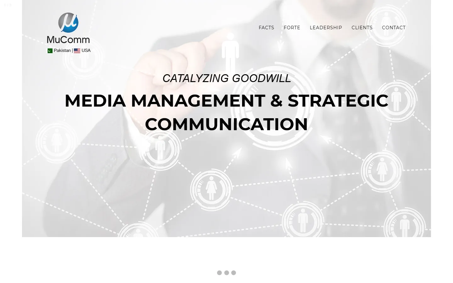
No headline at all
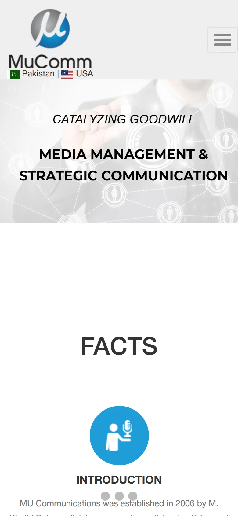
The page had no H1. The hero was a three-slide carousel, so two-thirds of the message was hidden at any moment — and most people don't wait for slides.
(Before) 02
Labels that don't help
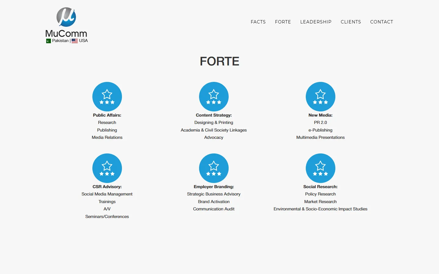
"Facts" and "Forte" name the type of content, not what the visitor will learn. Services were raw lists with no explanation of what a client actually gets.
(Before) 03
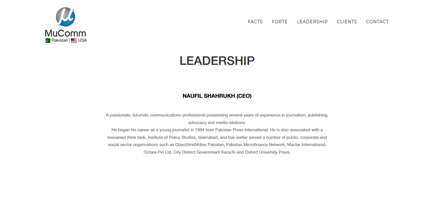
Leadership as one paragraph
Agencies are bought on people, but the leadership section was a single block of text, with no photo and no structure.
(Before) 04
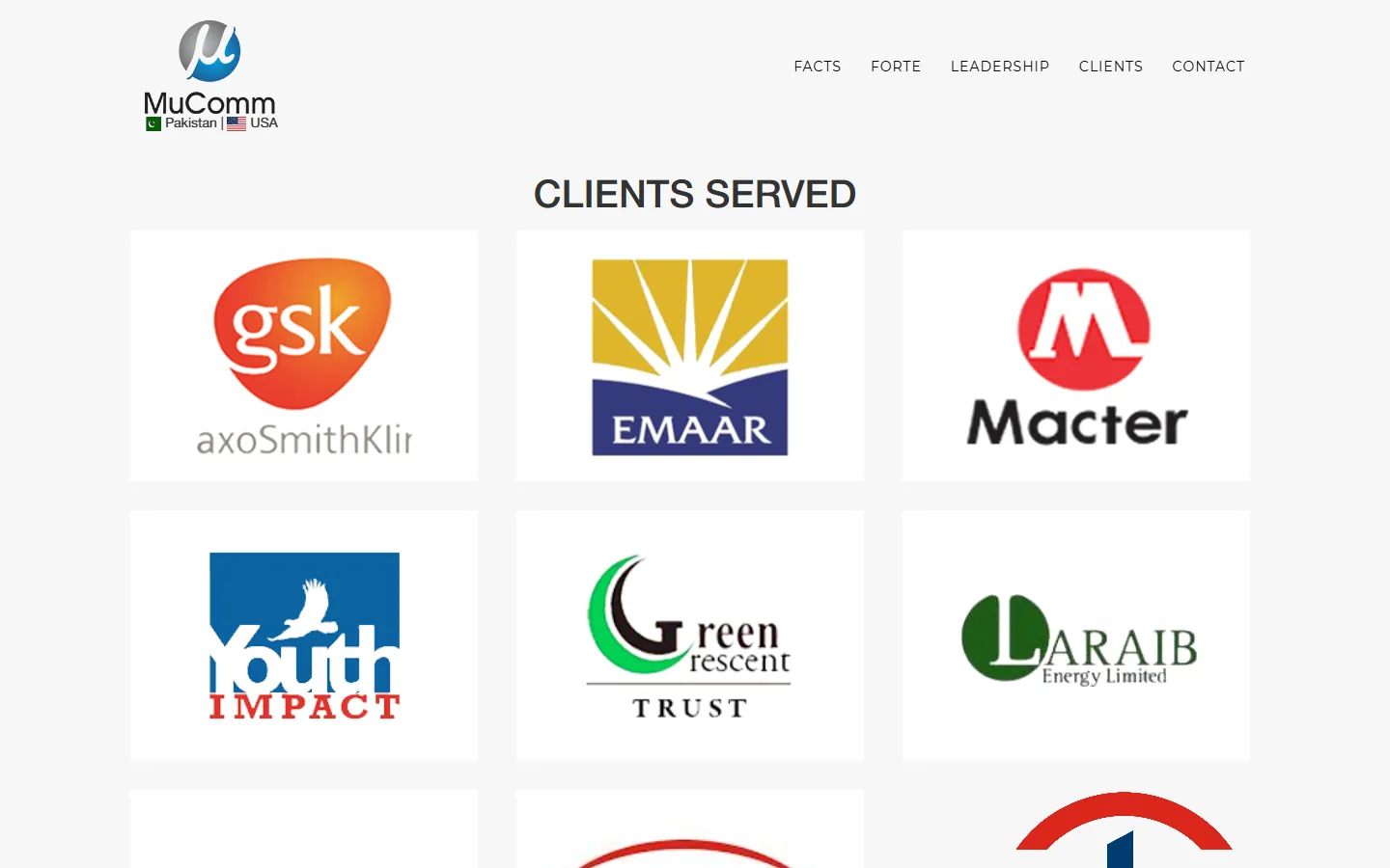
Client logos nobody could read
The logos were CSS background images — no names, no sectors, nothing for screen readers or search engines. The section's entire readable text was "CLIENTS SERVED".
(Before) 05
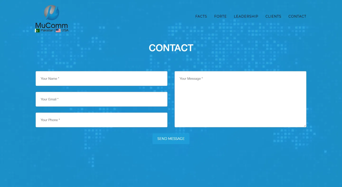
A high-friction form
Every field was required, including phone, and nothing said what would happen after sending.
(Before) 06
Visibly a template
"Powered by Epsilon", © 2022, hidden "Project Name" pop-ups with demo images, five typefaces and six images without alt text.
Principles
01
One clear promise above the fold
A single fixed headline replaces three hidden slides.
02
Answer questions in the order people ask them
Who → what → how → who with → for whom → where → how to start. One section per question.
03
Build trust deliberately
Twenty years, named clients, real leaders and real offices all appear before the contact form.
04
One primary action, always within reach
"Let's talk" lives in the nav, the hero, after the client wall and in the footer.
Key decisions
Headline
(Before)
No H1; a rotating three-slide carousel
(After)
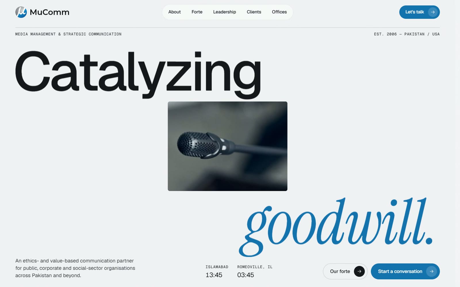
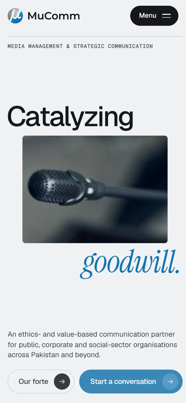
One fixed headline, "Catalyzing goodwill.", plus a positioning line naming who MuComm serves and where
(Why it's better)
One clear message beats three hidden ones — and it works for search engines and screen readers too.
(Before) 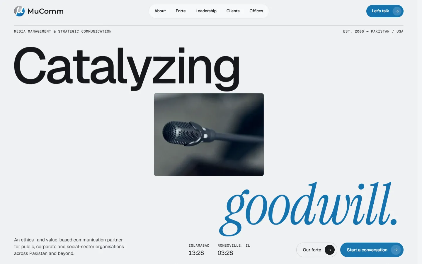
(After) Credibility at a glance
(Before)
Founding year buried in a paragraph
(After)
"Twenty years, 2006–2026" and live clocks for Islamabad and Romeoville in the hero
(Why it's better)
Proves longevity and a real two-country presence without reading a word of body copy.
About
(Before)
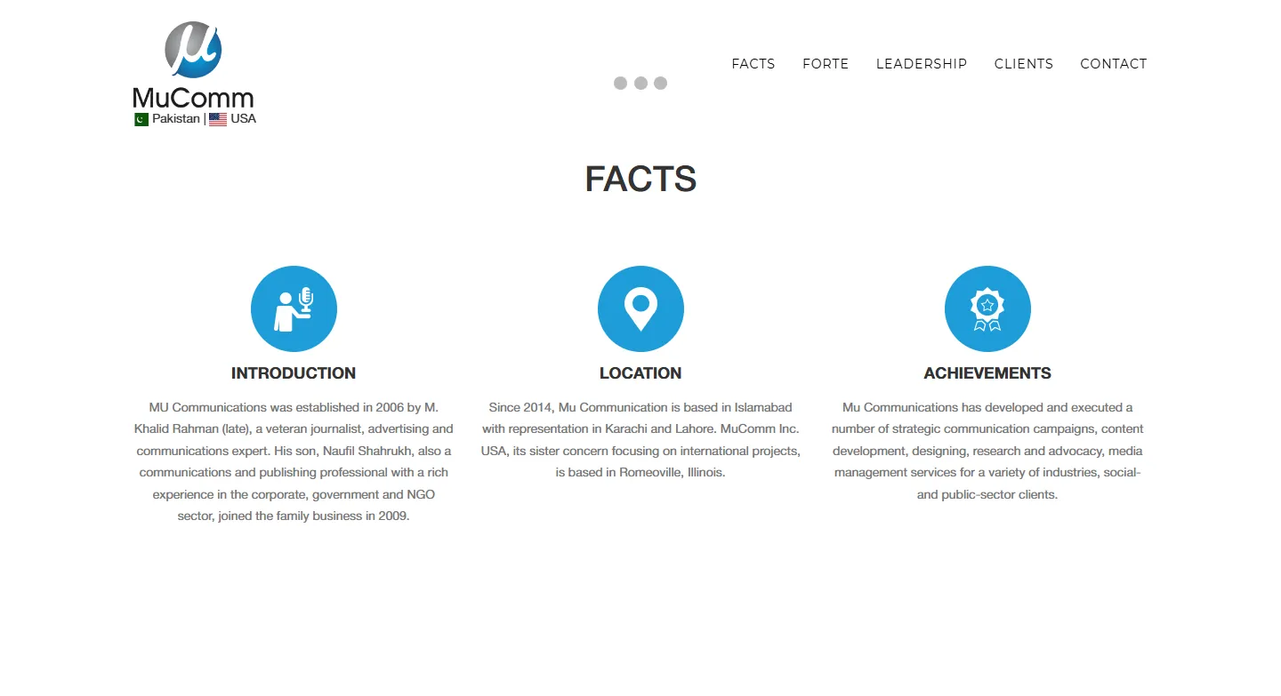
"Facts": three dense paragraphs
(After)
Three cards with benefit headlines: Founded on journalism · From Islamabad to Illinois · Campaigns that move people
(Why it's better)
The same facts, now scannable, each with a takeaway.
(Before) 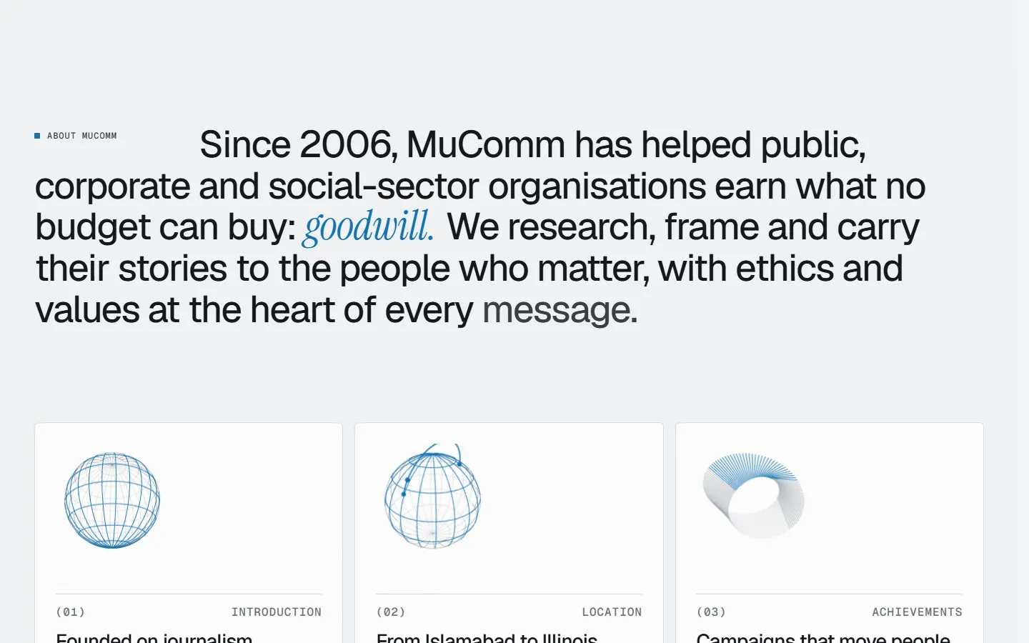
(After) Services
(Before)
Six bullet lists
(After)
"Six disciplines. One conversation." — each with a value statement, service tags and a photo
(Why it's better)
Tells the client what they get, not just the category names.
(Before) 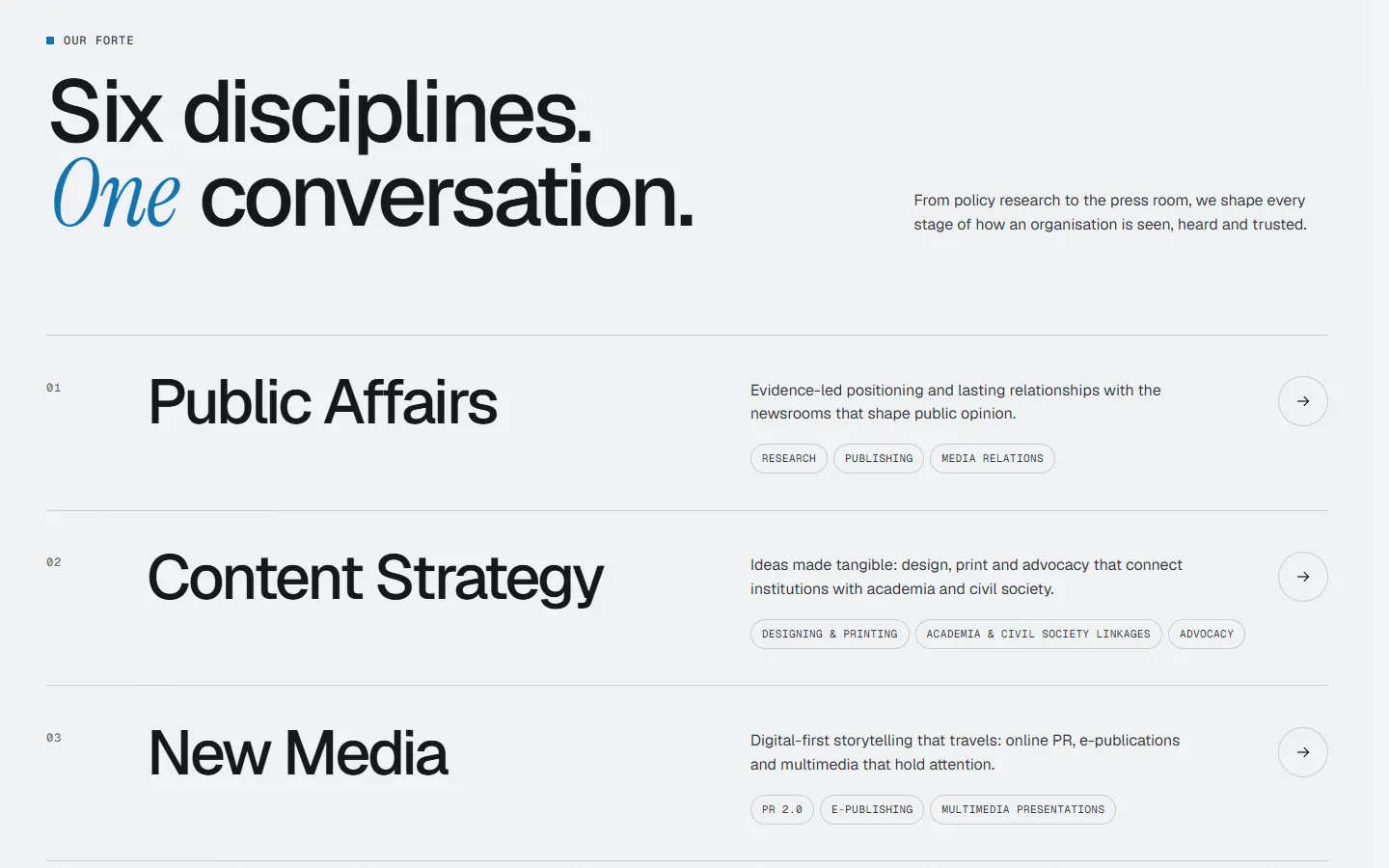
(After) Process
(Before)
None
(After)
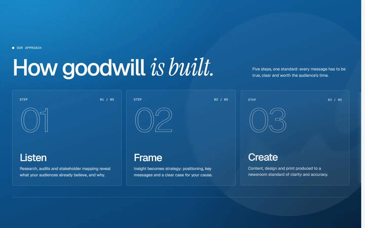
A five-step approach: Listen → Frame → Create → Amplify → Measure
(Why it's better)
B2B buyers fear the unknown. A visible process reduces risk and shows method.
(After) Leadership
(Before)
A one-paragraph bio
(After)
Portrait, a "Two decades, one conviction" headline, a 1994–2026 timeline and named past organisations
(Why it's better)
Agencies are bought on people. A face and a track record build trust.
(Before) 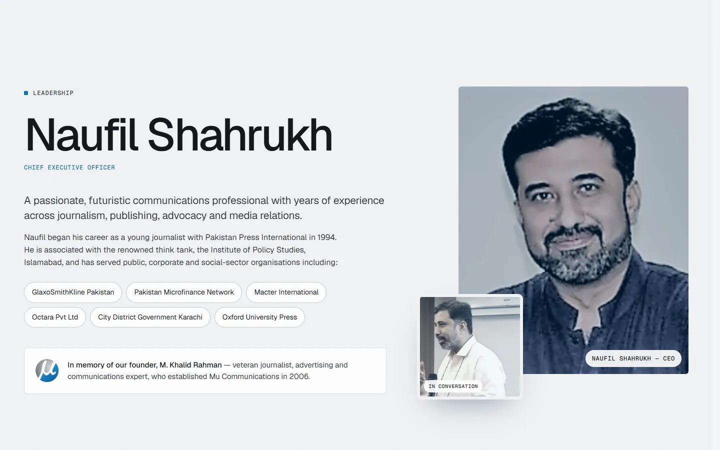
(After) Client proof
(Before)
Logo images with no names or alt text
(After)
11 named logos, each labelled by sector, then "Your organisation, next? Let's talk"
(Why it's better)
Visitors find someone like them — and the ask arrives when trust is highest.
(Before) 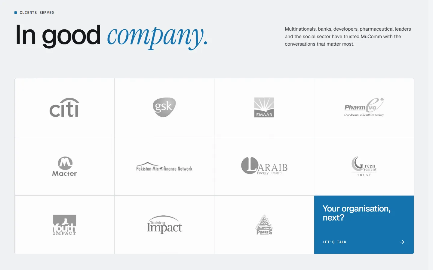
(After) Offices
(Before)
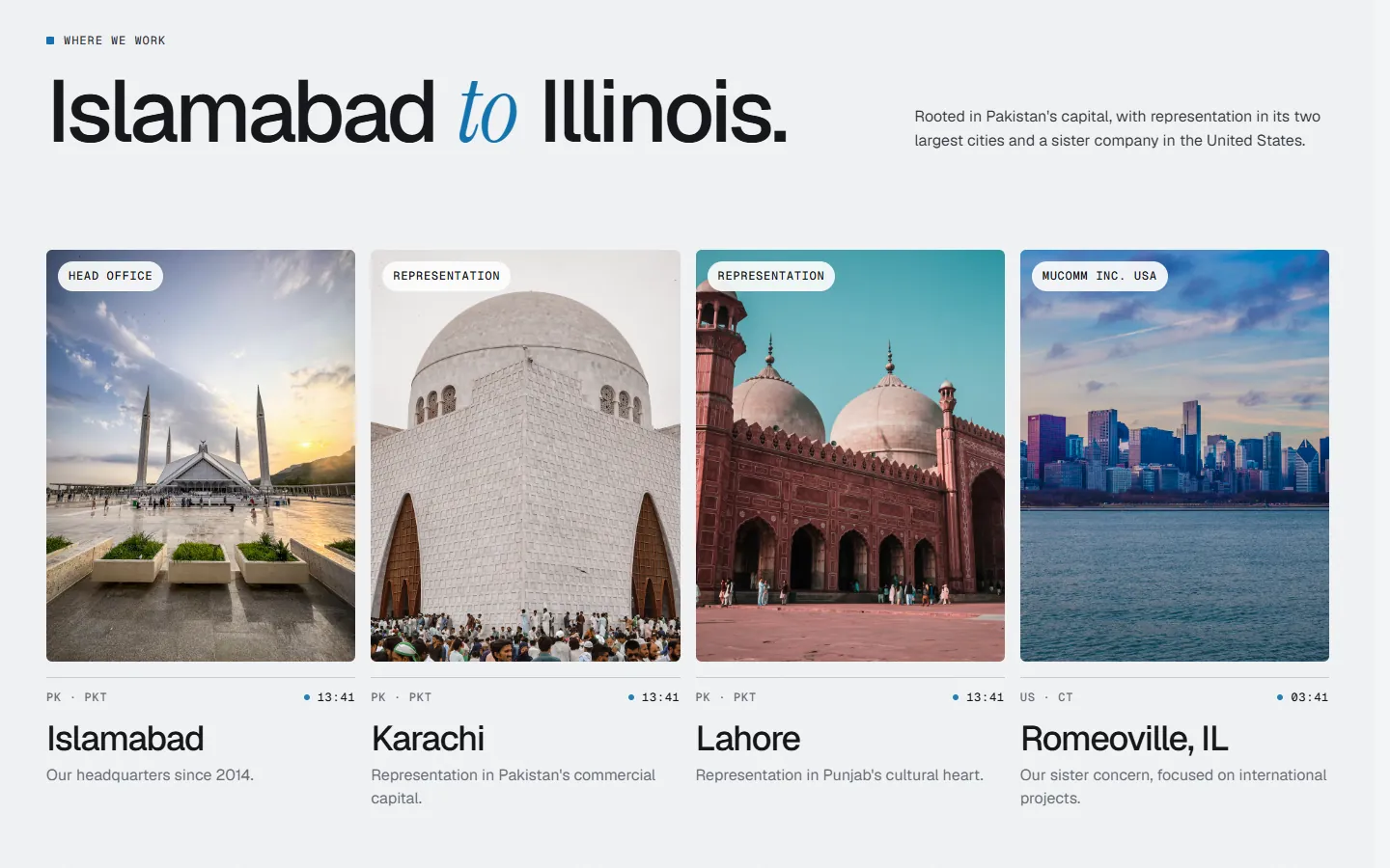
One sentence
(After)
A section for each city — HQ, representation offices and the US sister company — with photos and local times
(Why it's better)
Makes the "Pakistan / USA" claim concrete and credible.
(After) Contact form
(Before)
All fields required, no context
(After)
Interest chips for the six disciplines, organisation added, phone optional, "We'll come back with a point of view"
(Why it's better)
Pre-qualifies and routes leads, lowers effort and sets expectations for the reply.
(Before) 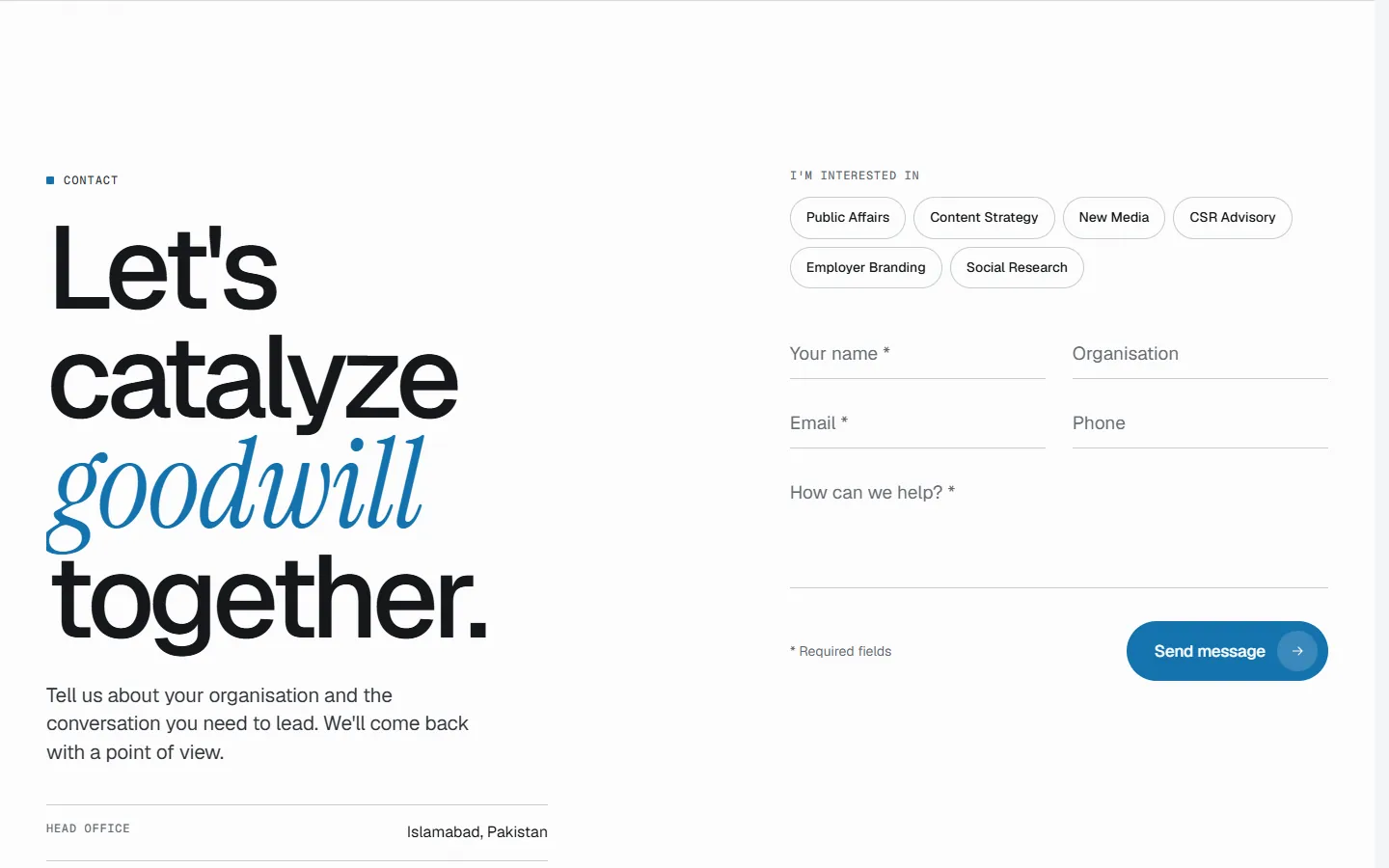
(After)
(On a phone)
The same first screen at 390 px wide, before and after.
Structure
(Old page order)
- 01Nav: Facts · Forte · Leadership · Clients · Contact
- 023-slide carousel
- 03Facts
- 04Forte (6 bullet lists)
- 05Leadership (one paragraph)
- 06Clients (unlabelled logos)
- 07Contact form
- 08Footer (© 2022, "Powered by Epsilon")
(New page order)
- 01Fixed nav + "Let's talk"
- 02Hero: one headline, live clocks, two CTAs
- 03About: three cards
- 04Forte: six disciplines
- 05Promise band
- 06Approach: Listen → Measure
- 07Leadership
- 08Clients: named, by sector + CTA
- 09Offices: four cities
- 10Contact: interest chips
- 11Footer: explore, offices, © 2026
Outcome
This is a concept redesign, so there are no live results. Below is what each change is designed to do, and how I'd test whether it works.
(What it's designed to do)
- Designed to make the agency legible in five seconds: what it does, who for, and where.
- Designed to lift lead quality: interest chips tell MuComm what an enquiry is about before they reply.
- Designed to lower form friction: phone is optional and required fields are marked.
- Accessibility and SEO foundations in place: an H1, a <main> landmark, a skip link, a meta description, a share image and descriptive alt text on every image (6 were missing).
(How I'd measure it)
- 5-second test on both versions: "What does this company do, and where is it based?"
- First-click test: "You want to hire them for a CSR campaign. Where do you click?"
- Live metrics: form submissions, which interest chips get chosen, and clicks on "Let's talk" by position.
(Trade-offs)
- About 2× longer to scroll (≈6,200 px → ≈13,300 px at 1440 px), though each section is lighter and easier to skim.
- More imagery means images must be optimised for slower connections — which matters for a Pakistan-based audience.
(Reflection)
Have a product website that needs to work harder?
Start a project(Next project · UI/UX)