(UI/UX case study · 02)
LegalConnect
- Client
- Role
- Year
- Type
- Tools
- Links
(Overview)
- (The product)
- A real-time iPhone marketplace connecting people who need legal cover with solicitors, barristers, interpreters and police-station reps across England & Wales.
- (Who it's for)
- Two sides: firms and clients posting matters ("need cover"), and legal professionals looking for work.
- (The page's job)
- App Store downloads from both sides of the marketplace.
The problem
What the audit of the original site found.
01
One message for two audiences
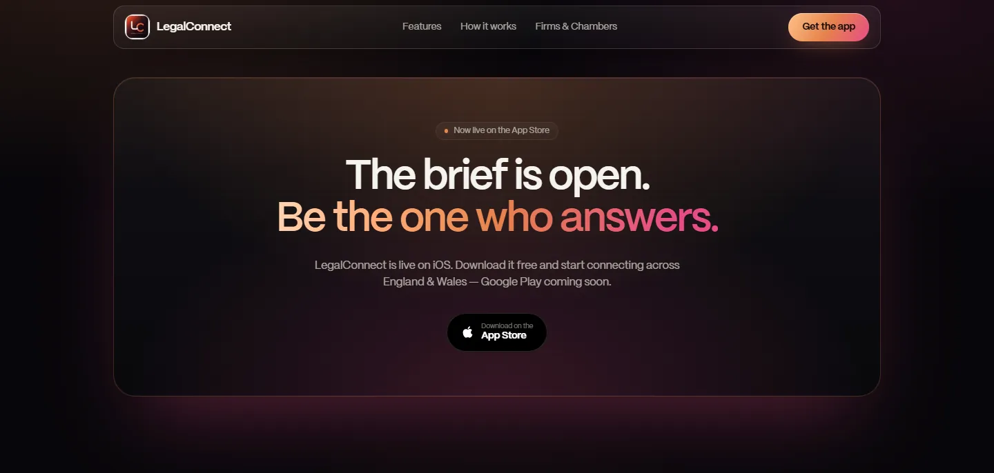
The hero addressed both sides at once. Neither was told "this is for you, and here's what you do next".
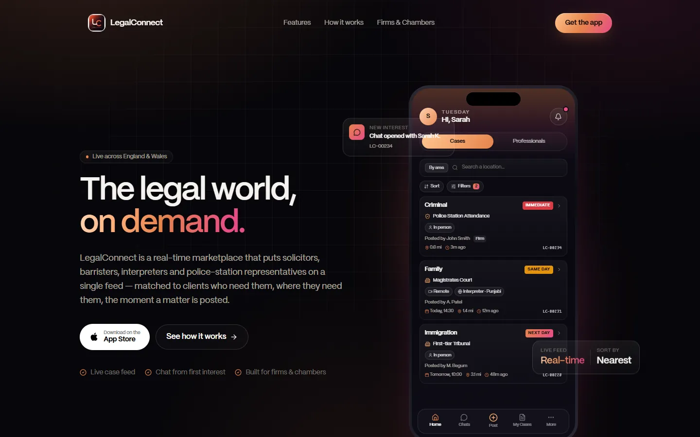
(Before) 02
Features before understanding
Six features came before "How it works", so visitors judged capabilities before they had a mental model of the product.
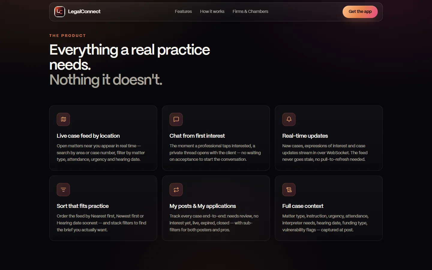
(Before) 03
Engineering language
"New cases… stream in over WebSocket. The feed never goes stale, no pull-to-refresh needed." That's how a developer describes it, not a solicitor.
04
Thin trust for a legal product
Nothing about verification, ratings or reviews, no FAQ, and the "not a provider of legal advice" disclaimer only in footer fine print.
05
Doubts answered late — and a dead end on desktop
"Free" and "Google Play coming soon" only appeared at the bottom, and a laptop visitor's only option was an App Store button that installs nothing.
(Before)
Principles
01
Speak to each audience directly
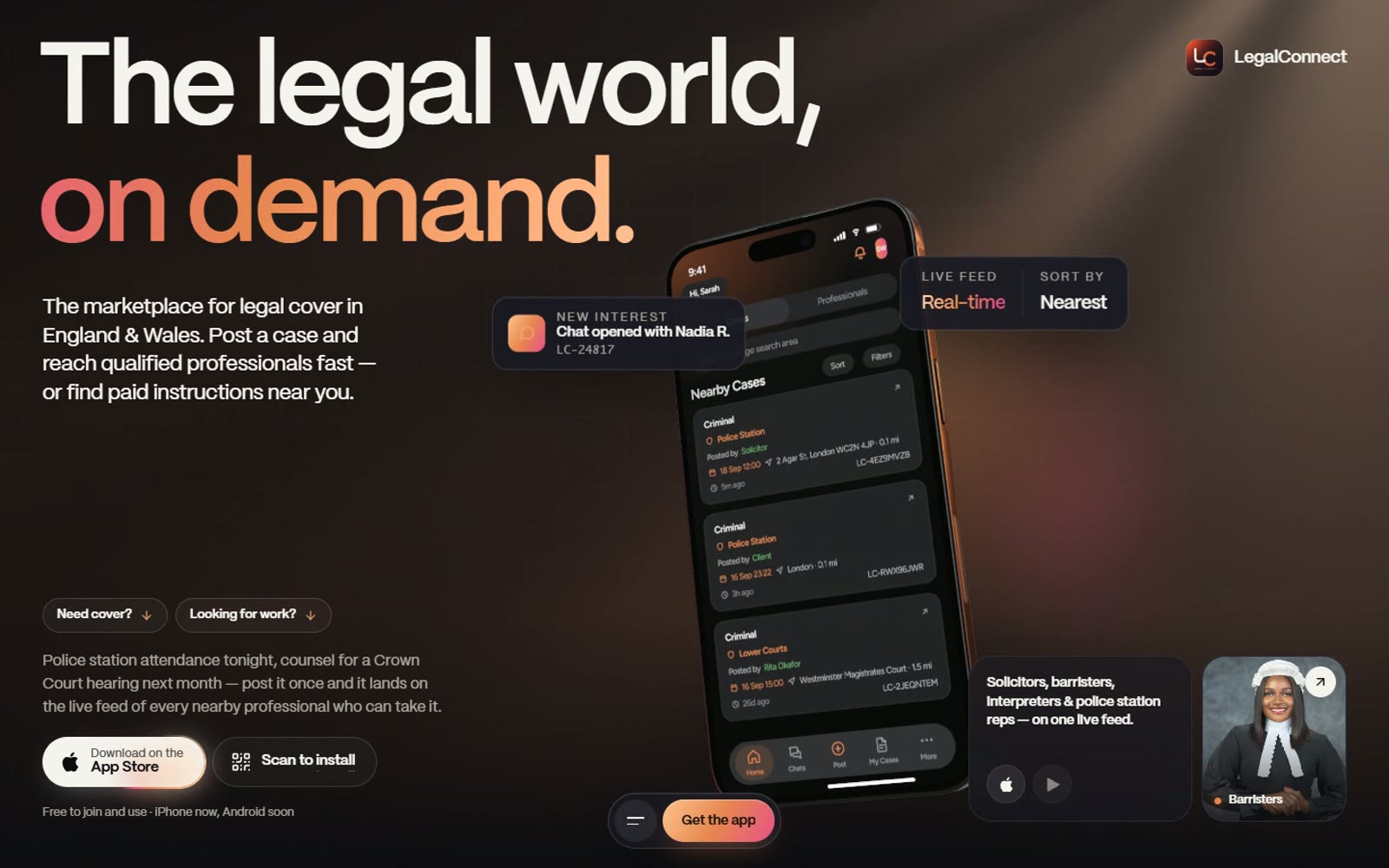
Two entry points — "Need cover?" and "Looking for work?" — and a specific benefit for every profession.
02
Show, don't tell
A phone that plays the whole matching loop replaces three text blocks.
03
Build trust deliberately
Verification, two-way reviews, endorsements and a clear "we don't give legal advice" answer.
04
One primary action, always within reach
App Store, a QR code for desktop and a persistent "Get the app" dock.
Key decisions
Audience routing
(Before)
One generic hero paragraph
(After)
"Need cover?" jumps to the posting flow; "Looking for work?" jumps to the professions
(Why it's better)
Visitors pick their side and get a relevant story in one click — the standard pattern for two-sided marketplaces.
(Before) 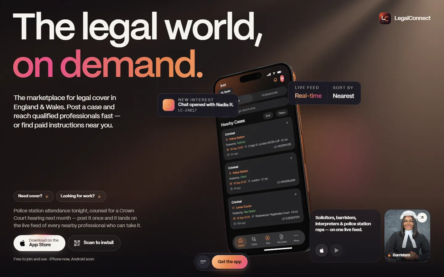
(After) Positioning
(Before)
"Instant access to UK legal expertise"
(After)
"The marketplace for legal cover in England & Wales"
(Why it's better)
Names the category, the job and the coverage. More specific is more credible — and easier to find.
Narrative order
(Before)
Features → How it works
(After)
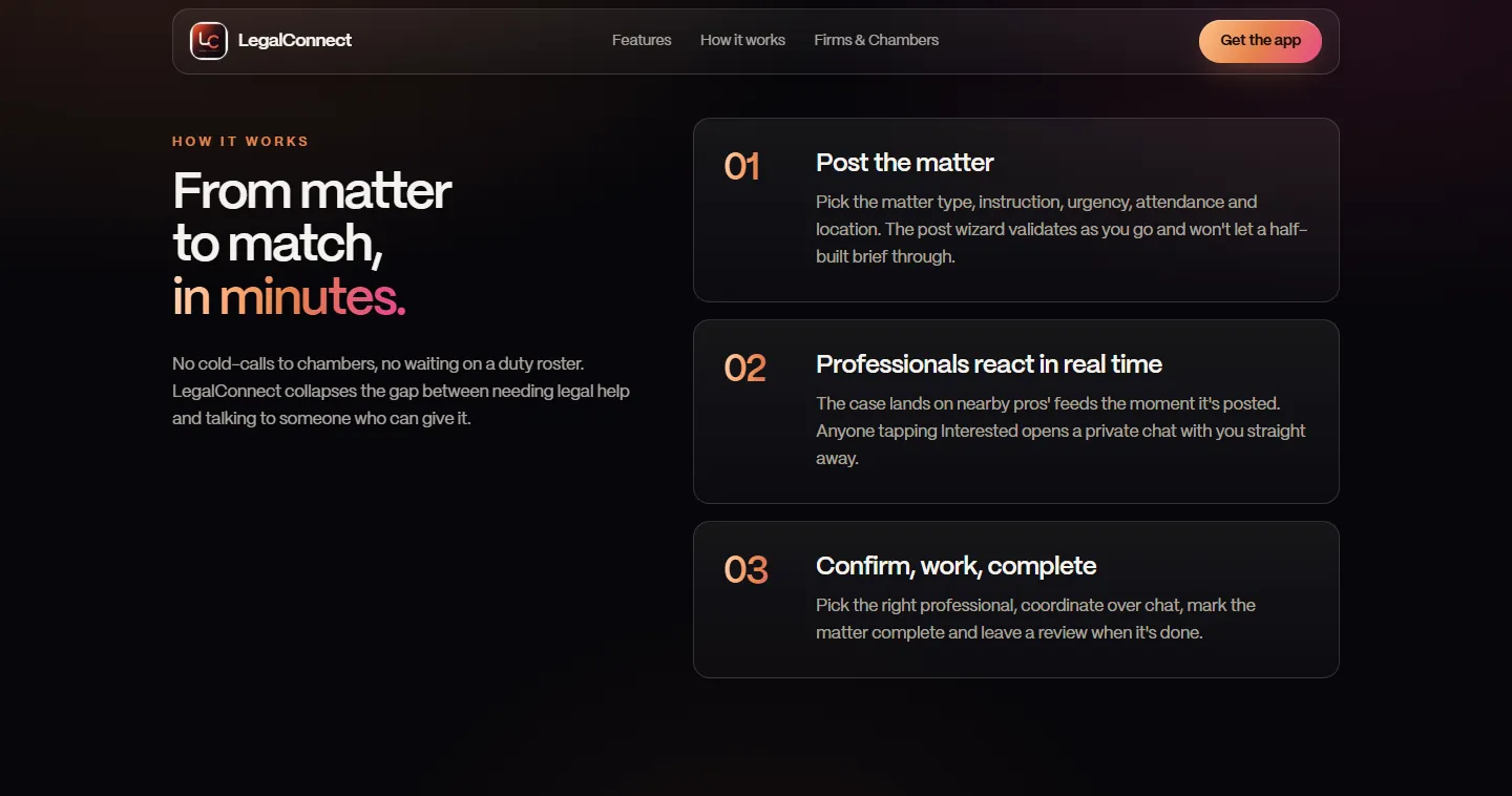
How it works → Features
(Why it's better)
The mental model comes first and the details second (progressive disclosure).
How it works
(Before)
Three text blocks
(After)
Three steps pinned while the phone plays: matter posted → interest → private chat → accepted → complete → review
(Why it's better)
Visitors watch the full loop. Motion explains cause and effect — this is where my motion background shows.
(Before) Trust
(Before)
"Real-time updates" (WebSocket)
(After)
"Verified, rated, endorsed": verified badges, two-way 1–5★ reviews, endorsements, completed-case history
(Why it's better)
For a legal service the barrier is trust, not speed. A technical feature became a trust feature.
(Before) 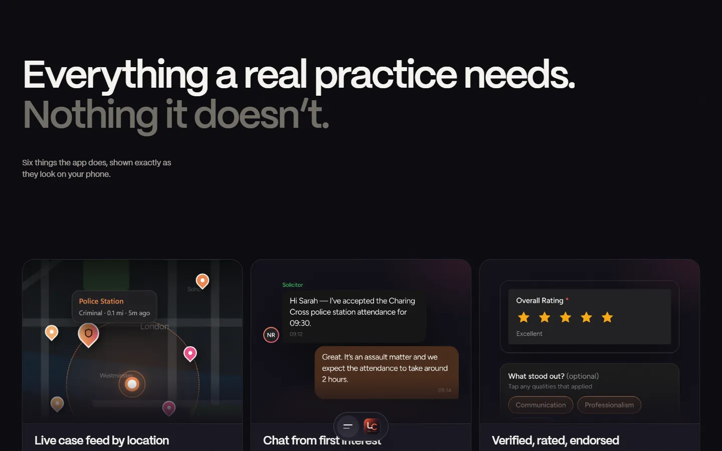
(After) Role-based value
(Before)
Four profession names
(After)
Each profession gets its own one-line benefit — e.g. police-station reps: immediate attendances, nearest first
(Why it's better)
People see their own job described, which builds recognition and relevance.
(After) Friction & desktop
(Before)
"Free" once, at the bottom; App Store button only
(After)
"Free to join and use · iPhone now, Android soon" under the main button, plus a QR code: "Point your iPhone camera here"
(Why it's better)
Answers the two biggest hesitations where the decision is made, and fixes the desktop-to-iPhone dead end.
(Before) 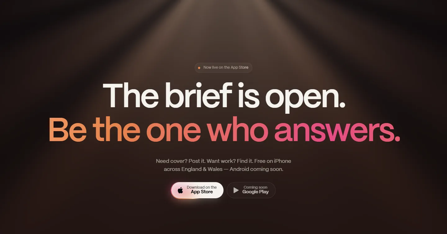
(After) Objections
(Before)
No FAQ
(After)
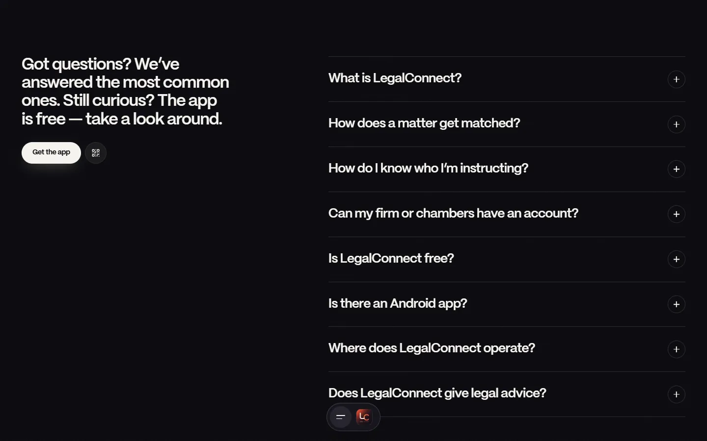
Eight questions — matching, cost, Android, coverage, and "Does it give legal advice? No."
(Why it's better)
Handles doubts on the page and moves the regulatory disclaimer from fine print into a clear answer.
(After)
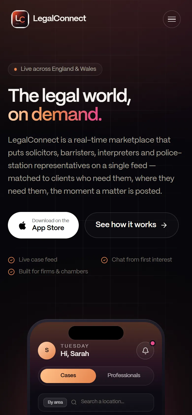
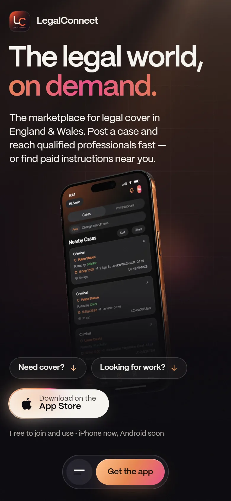
(On a phone)
The same first screen at 390 px wide, before and after.
Structure
(Old page order)
- 01Hero: download + "See how it works"
- 02Feature ticker
- 036 features
- 04How it works (3 steps)
- 05Who's on the platform
- 06Firms & Chambers
- 07Matter / instruction types
- 08Final CTA
(New page order)
- 01Hero: two audience paths, App Store + QR, "Free · Android soon"
- 02How it works: 3 pinned steps
- 036 features, as they look on the phone
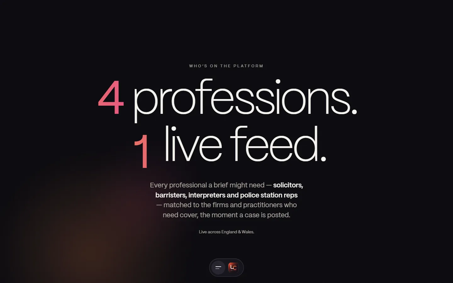
- 044 professions, 1 live feed
- 05Firms & Chambers: interactive
- 06Matter & instruction types
- 07FAQ (8 questions)
- 08Final CTA
- 09Persistent "Get the app" dock
Outcome
This is a concept redesign, so there are no live results. Below is what each change is designed to do, and how I'd test whether it works.
(What it's designed to do)
- Designed to fix the stages where marketplace visitors drop off: "Is this for me?" and "Can I trust the people on it?"
- Designed so a desktop visitor can still install — the QR code turns a dead end into a path.
- Same brand and typeface (PP Mori) as before: this was a structure, audience and trust redesign, not a visual rescue.
- I shared the redesign with the LegalConnect team, who responded positively.
(How I'd measure it)
- 5-second test on both heroes: "What is this, and who is it for?"
- Task test: "You're a barrister. Find out how you'd get work near you." Time it and count errors on both sites.
- Live metrics: App Store click-through, QR scans, which audience path gets clicked, FAQ opens and scroll depth.
(Trade-offs)
- About 3× longer to scroll (≈5,100 px → ≈16,000 px at 1440 px), partly from the pinned sections — offset by the audience jump links and the dock.
- The 3D phone and pinned scrolling need performance checks on low-end phones; reduced-motion preferences are respected.
(Reflection)
Have a product website that needs to work harder?
Start a project(Next project · UI/UX)