(UI/UX case study · 03)
Listly
- Client
- Role
- Year
- Type
- Tools
- Links
(Overview)
- (The product)
- A Chrome extension that fills Facebook Marketplace vehicle listings straight from a dealership's website. Paid SaaS with a 3-day free trial.
- (Who it's for)
- Busy, sceptical car-dealership salespeople and managers. They care how much time it saves and whether it works with the site they already have.
- (The page's job)
- Trial starts.
The problem
What the audit of the original site found.
01
The headline contradicted the product
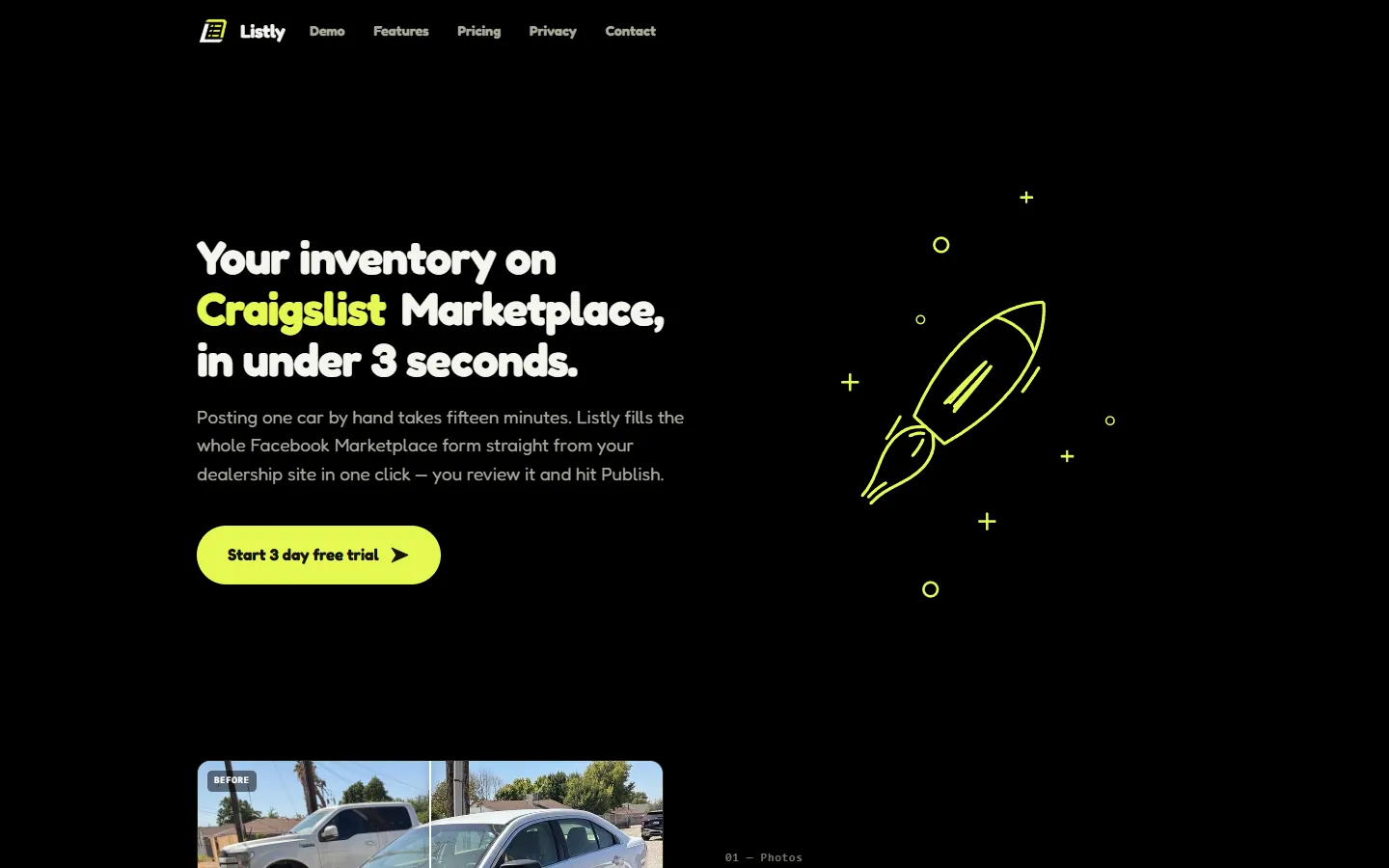
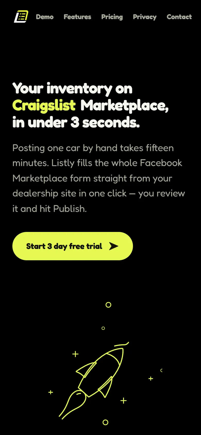
The H1 rotated through marketplace names — Craigslist, Cars.com, CarGurus — including CarGurus, which the same page marked "Soon". The most important sentence promised what the product couldn't do yet.
(Before) 02
It never said what Listly is
Nothing above the fold said "Chrome extension" — the key fact for judging how much effort setup takes.
03
It led with a secondary feature
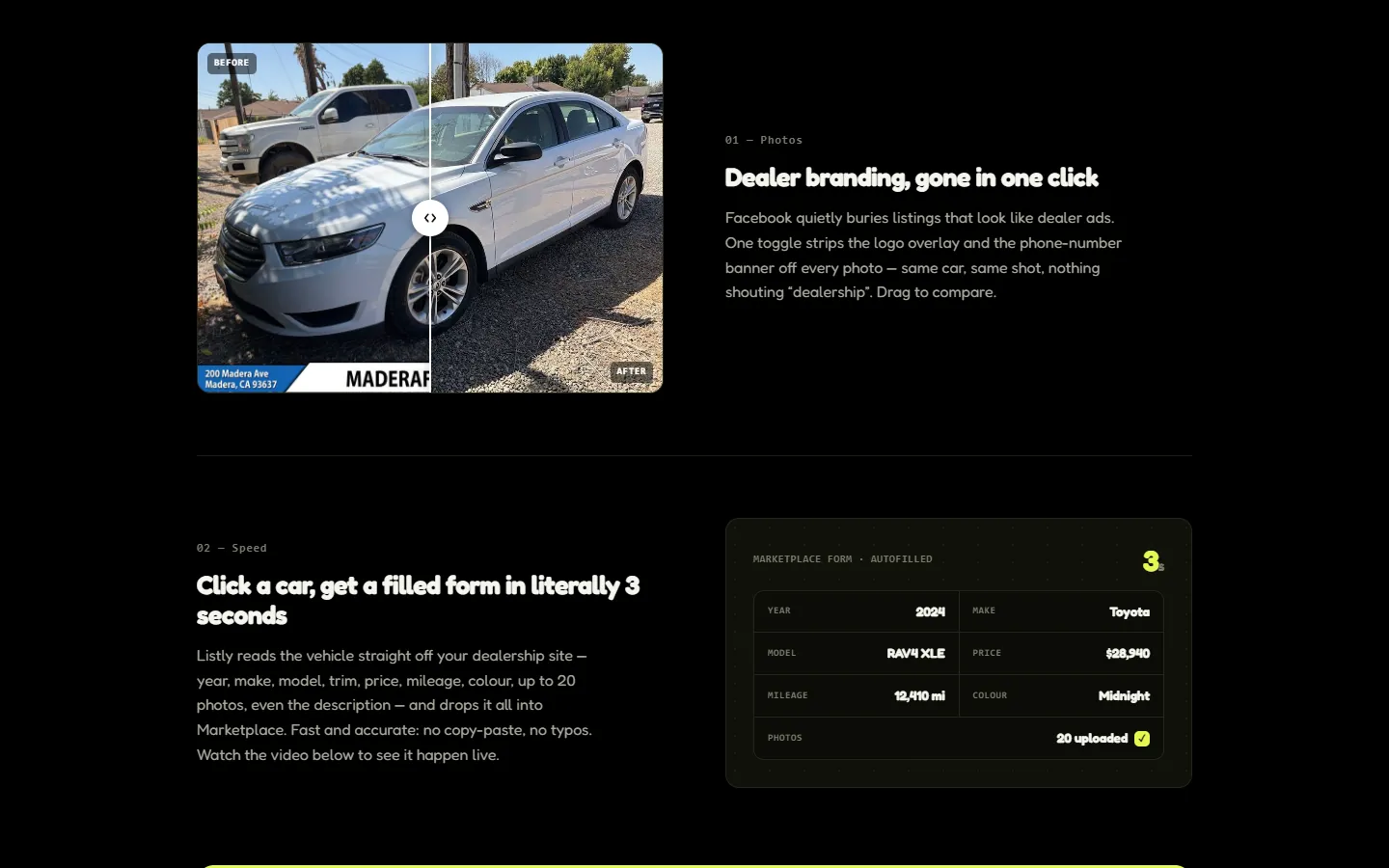
Feature 01 was photo branding removal. The core promise, a filled listing in 3 seconds, came second.
(Before) 04
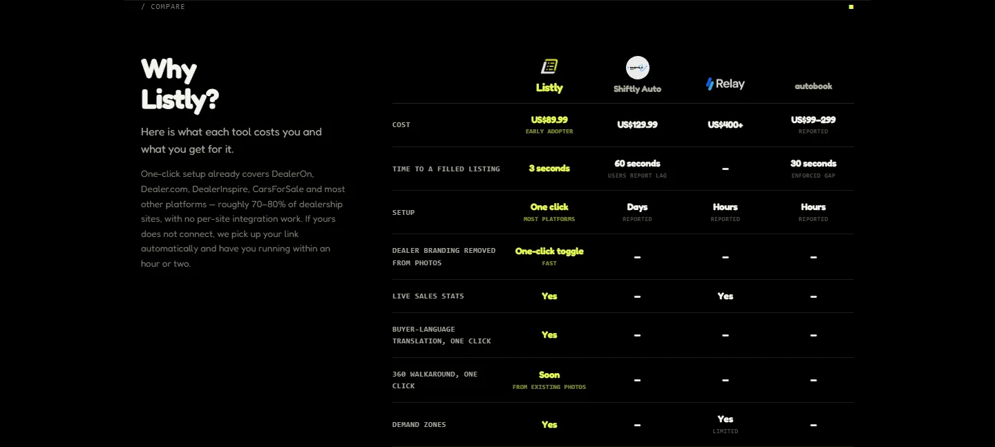
The #1 B2B question was buried
"Will it work with my dealership website?" was answered in one paragraph inside the comparison section near the bottom.
(Before) 05
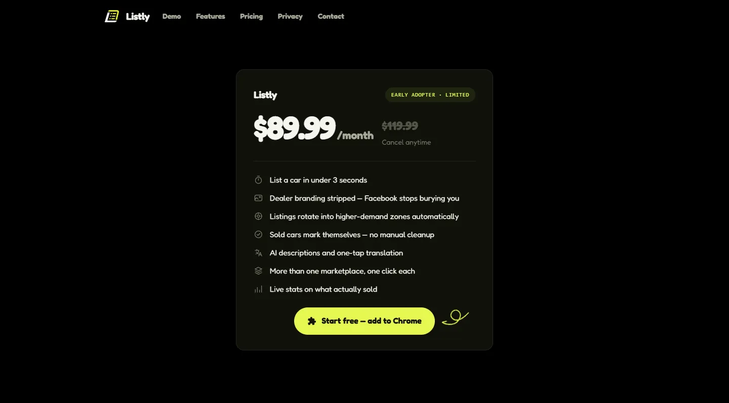
Pricing without context, and no FAQ
A price card with no heading, no onboarding steps, no billing details and no guarantee — for a paid tool that asks to touch dealers' listings.
(Before)
Principles
01
One clear promise above the fold
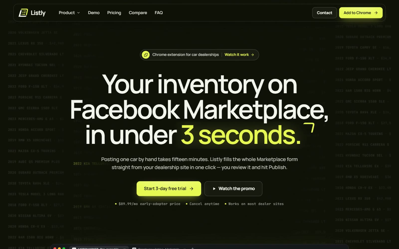
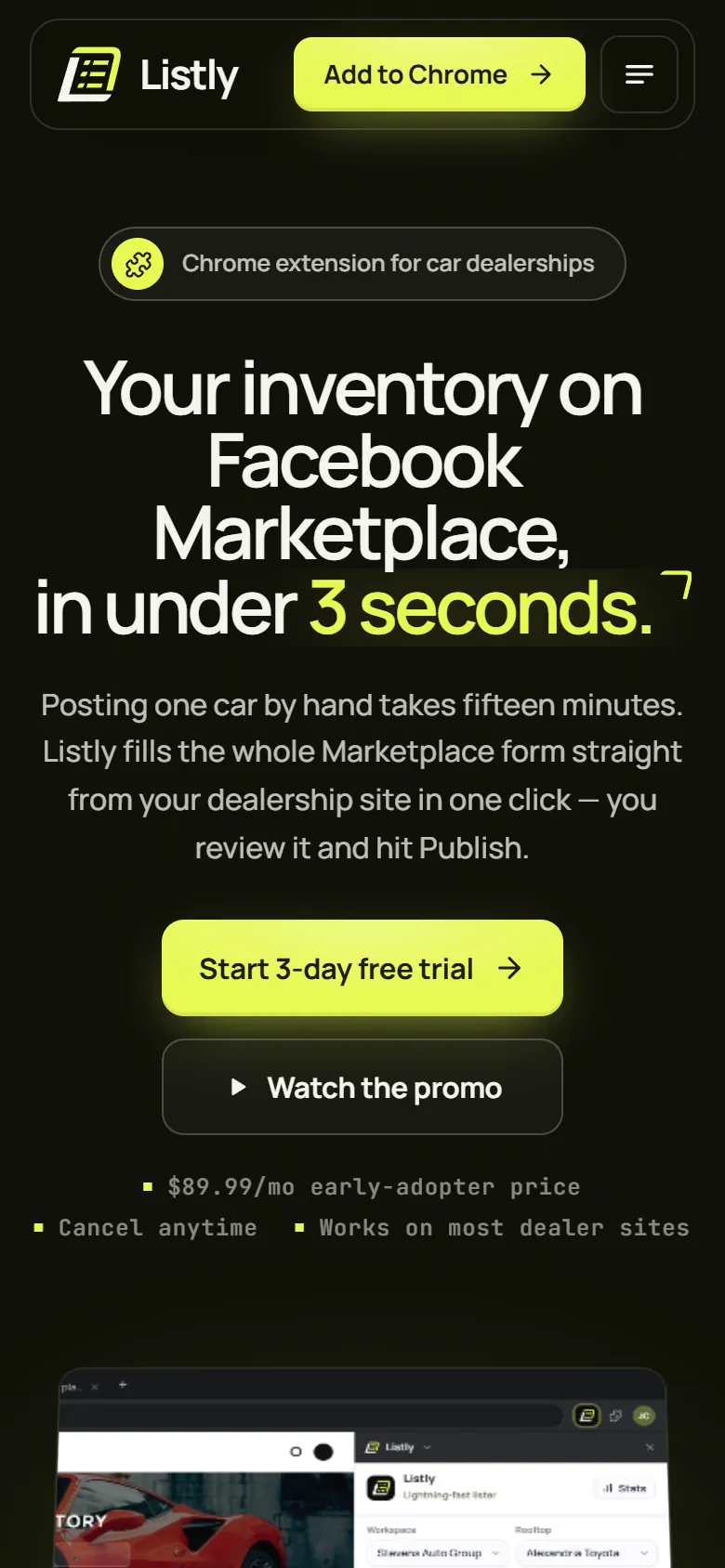
A fixed, accurate headline and a "Chrome extension for car dealerships" eyebrow.
02
Show, don't tell
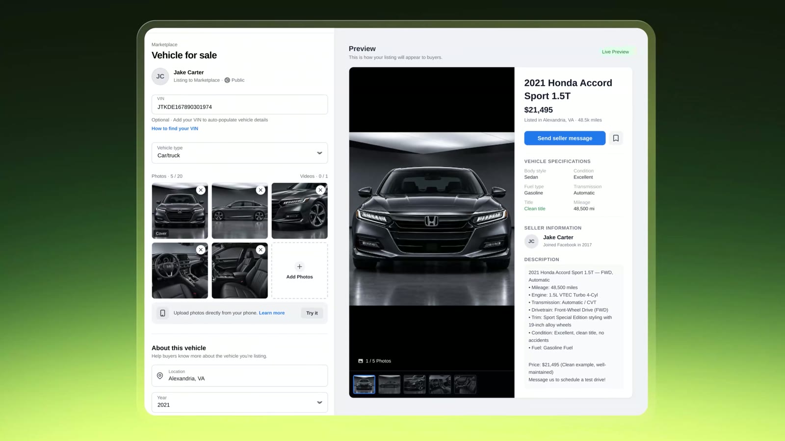
A working simulation of the product's core moment, right in the hero.
03
Answer objections in the order people have them
Will it work for me? How? Can I trust it? What does it cost? What if it doesn't work out?
04
One primary action, always within reach
"Start 3-day free trial" in the hero, nav, pricing and final section — with lower-effort paths beside it.
Key decisions
Message accuracy
(Before)
Rotating "CarGurus / Craigslist Marketplace"
(After)
Fixed "Facebook Marketplace", matching the title, meta description and what's actually live
(Why it's better)
Never promise what's "Soon" in the headline. A stable H1 is readable, trustworthy and searchable.
(Before) 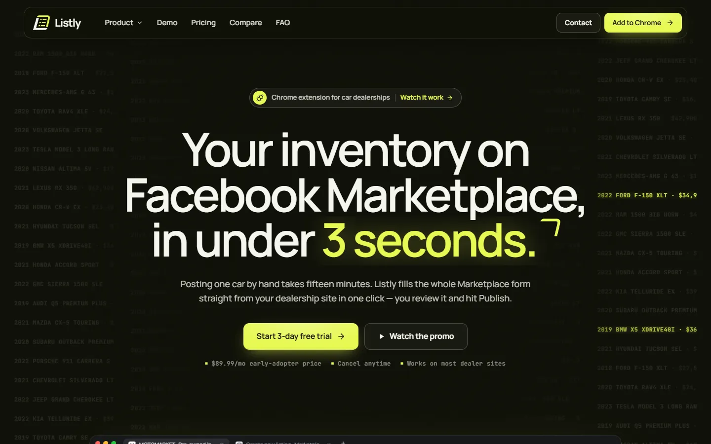
(After) Reassurance at the CTA
(Before)
None
(After)
"$89.99/mo early-adopter price · Cancel anytime · Works on most dealer sites" under the button, plus "Watch the promo"
(Why it's better)
Removes price, commitment and compatibility doubts at the moment of decision — and gives the not-ready a lower-effort step.
Compatibility
(Before)
One paragraph near the bottom
(After)
A strip of dealer platforms right after the hero, Live / Soon badges for each marketplace, and a fallback promise
(Why it's better)
Answers "will it work with what I have?" before the visitor has to ask.
(Before) 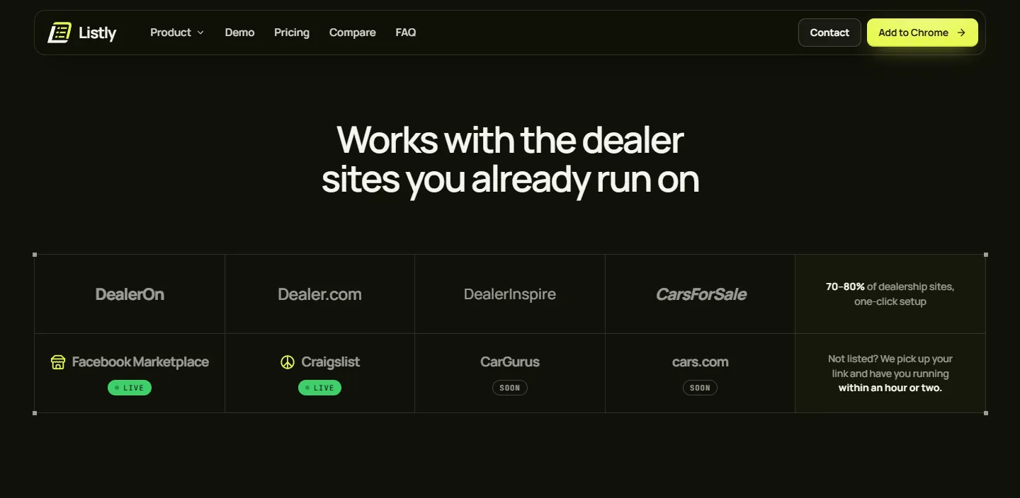
(After) Feature priority
(Before)
Photos first
(After)
Speed first, with a bar comparing Listly (~3 s), other tools (30–60 s) and posting by hand (~15 min)
(Why it's better)
Lead with the core value, and make the claim concrete and comparative.
(Before) 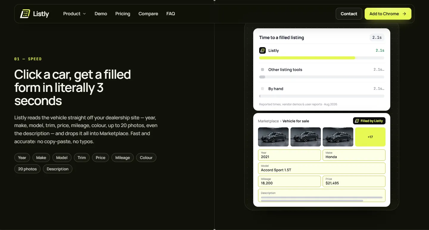
(After) Personal ROI
(Before)
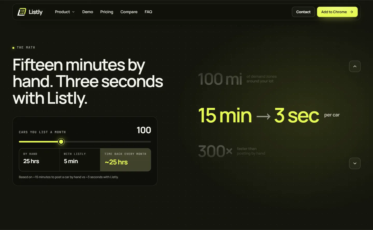
A static "~25 hrs saved at ~100 listings"
(After)
A slider: cars you list per month → hours by hand vs with Listly → time back
(Why it's better)
Each dealer sees their own number; personalised value persuades better than a generic stat.
(After) Pricing
(Before)
A price card with no heading
(After)
"One plan. Every feature." + 3 onboarding steps, billing through Stripe, cancel from the panel and a 14-day performance refund
(Why it's better)
Transparency plus risk reversal lowers the fear of committing; the 3 steps show how small the effort is.
(Before) 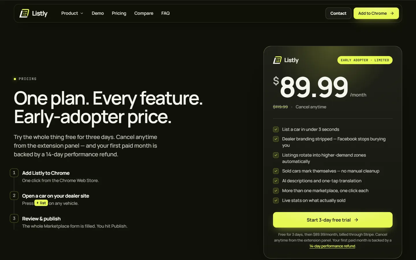
(After) Objections
(Before)
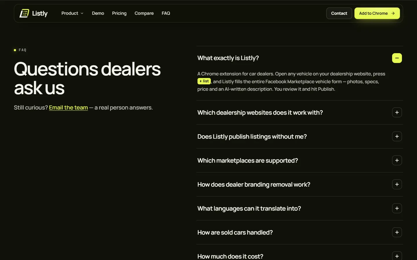
No FAQ
(After)
Nine dealer questions, including "Does Listly publish listings without me?" and "Is Listly affiliated with Facebook?"
(Why it's better)
Handles worries about control, compliance and compatibility on the page instead of losing the visitor.
(After) Navigation & type
(Before)
Demo · Features · Pricing · Privacy · Contact; four to five typefaces; H1 at 48 px
(After)
Product · Demo · Pricing · Compare · FAQ · Contact + "Add to Chrome"; two typefaces; H1 at ~94 px
(Why it's better)
The nav mirrors the buyer's questions and holds the main action; one consistent voice, and the headline is clearly where the page starts.
(On a phone)
The same first screen at 390 px wide, before and after.
Structure
(Old page order)
- 01Hero: rotating headline, one CTA
- 02What Listly does: 01 Photos
- 0302 Speed
- 04"Your numbers, live" stats
- 0503 Reach · 04 AI copy · 05 Relocation
- 06"See it live below" video
- 07Price card
- 08Compare table + stats
- 09Footer
(New page order)
- 01Live inventory ticker
- 02Hero: eyebrow, fixed headline, two CTAs, reassurance, interactive demo
- 03Compatibility strip
- 04Every listing, done for you: speed first
- 05Meet Listly — my product film
- 06Four things you'll never do again
- 07The math: ROI slider
- 08Your numbers, live: dashboard
- 09Compare table
- 10Pricing: steps, billing, refund
- 11FAQ (9 questions)
- 12Final CTA + "Talk to the team"
Outcome
This is a concept redesign, so there are no live results. Below is what each change is designed to do, and how I'd test whether it works.
(What it's designed to do)
- Designed so every level of readiness has a path: trial for the ready, the promo film for the curious, the ROI slider and dashboard for evaluators, the compare table for shoppers, the FAQ and refund for doubters, and "Talk to the team" for anyone who wants a person.
- Designed to target the two biggest causes of a lost trial — fear of cost and fear of it not working — with microcopy under the button and a refund guarantee.
- Foundations added: a share image, structured data, a <main> landmark and a skip link.
(How I'd measure it)
- A/B test of the old vs new hero, measuring trial starts per visitor.
- Engagement with the demo, the ROI slider, promo plays and FAQ opens.
- 5-second test on both versions: "What is Listly and who is it for?"
(Trade-offs)
- About 3× longer to scroll (≈6,300 px → ≈18,400 px at 1440 px). Long-form suits a considered B2B purchase, and nav anchors and repeated CTAs offset it — but scroll depth should be tested.
- Naming competitors needs facts that stay accurate: the compare table is dated and needs regular review.
- Many live demos mean more JavaScript, so it needs testing on older dealership PCs.
(Reflection)
Have a product website that needs to work harder?
Start a project(Next project)